


hopo is a premium baby‑essentials brand built around softness, safety, and thoughtful design.
Every product is created to support the quiet, intimate moments of early parenthood — the ones that happen at home, in calm spaces, with simple objects that feel good to touch and easy to trust.
hopo focuses on timeless essentials made with care, natural materials, and a warm, modern aesthetic.


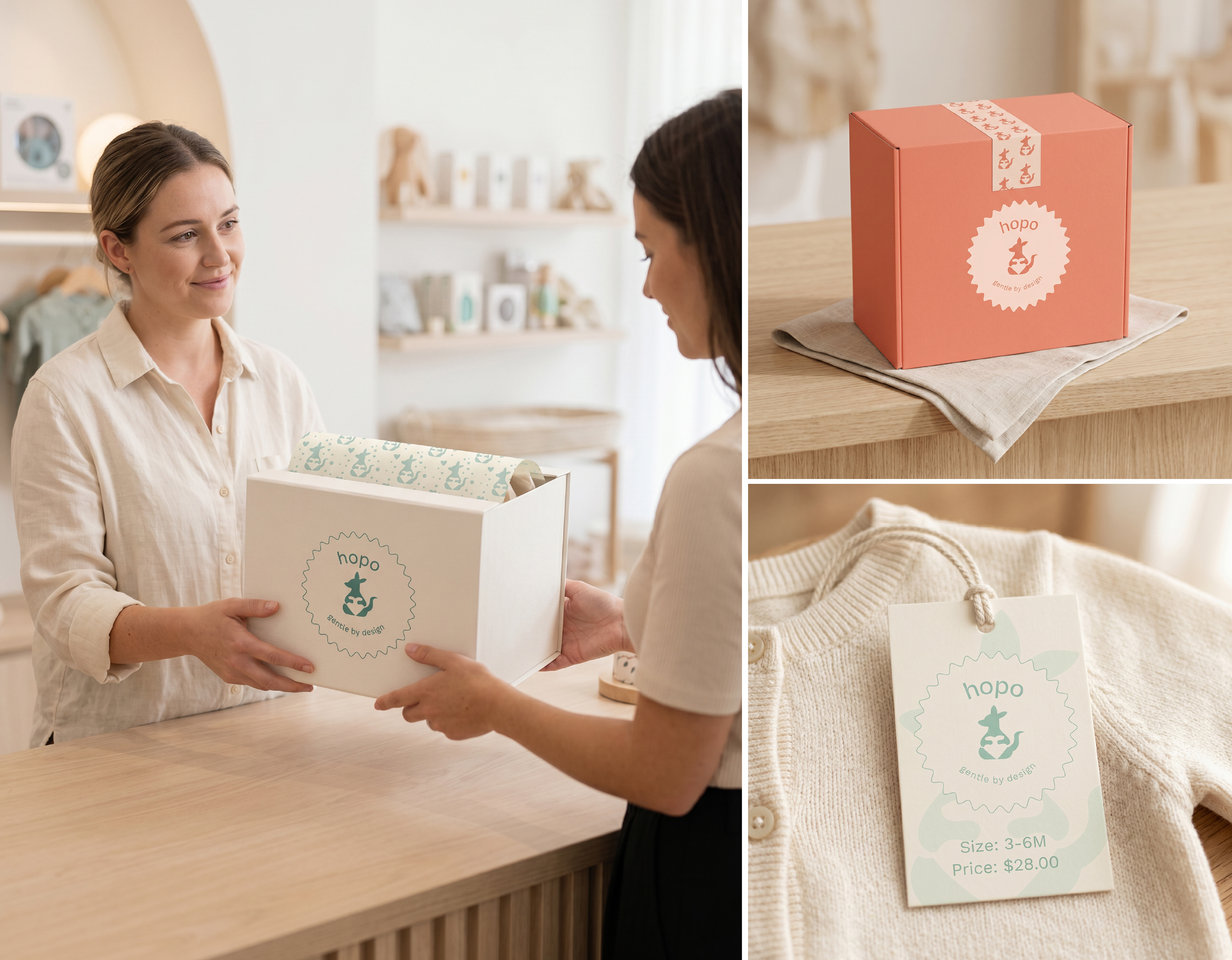
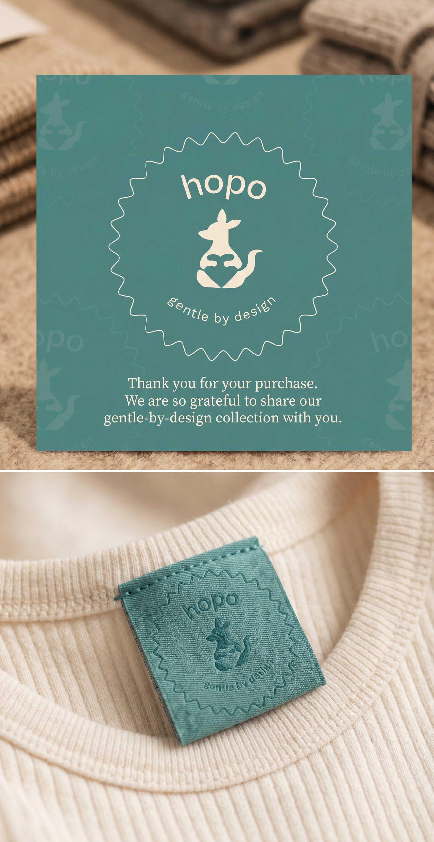
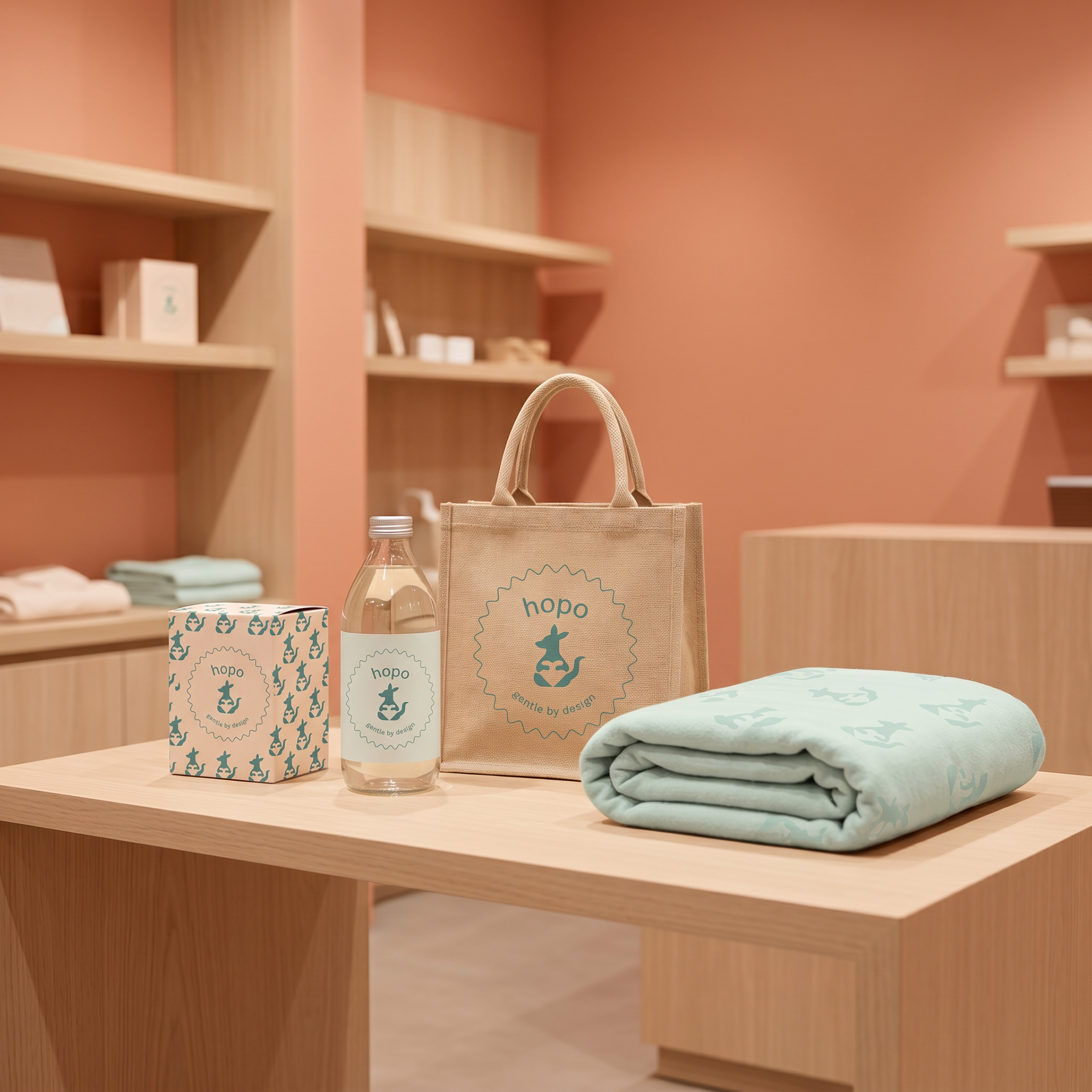
With the pattern language defined, the next step is bringing it into the physical world. These gentle textures and colours now wrap hopo's packaging, adding warmth, identity, and a sense of care to every unboxing moment.



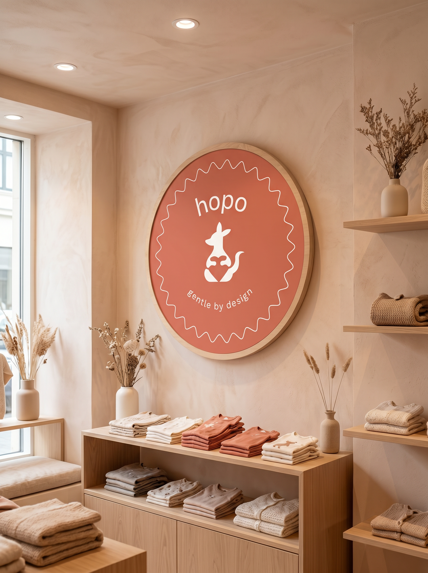

Bringing hopo to social media meant translating its softness, calm colours, and gentle identity into a warm, cohesive Instagram presence — blending product moments, lifestyle warmth, and brand textures into a feed that feels as comforting as the products themselves.

Thank you for exploring hopo with me. I hope this project conveyed the softness, calm and gentle world I set out to create.
Open to new collaborations — you can reach me through my website:
Let’s connect!
All visuals shown are part of a conceptual design presentation.
© 2026 LUXstudio. All rights reserved.


