bamboo started with a question I couldn't shake: why does "natural" beauty so often come with a compromise — on texture, on results, or on the planet? This self-initiated concept project is my answer to that question, imagining a skin and haircare brand built around botanical ingredients, honest about what's in them and what they can actually do.
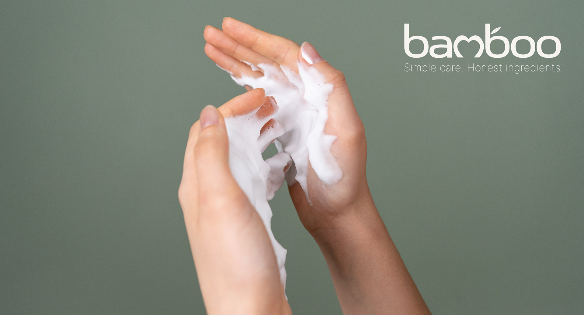
The name points to something specific: bamboo grows quickly, asks for little, and gives back more than it takes. That's the standard I wanted these products to meet — and the idea I set out to translate into a visual identity. It's why care is built into the wordmark itself: a heart shaped from the letters, a single leaf growing out of the type, the concept made visible before a single word is read.
bamboo isn't meant to be a beauty line first. It's an exploration of what a small, sustainable, considered approach to body and hair care could look like — and an exercise in logo design, wordmark construction, and identity development along the way.


Each step in this ritual is designed to feel intentional — from nourishing the skin to restoring the hair and embracing the warmth of post‑shower care. bamboo celebrates these quiet moments of softness, where natural textures, gentle botanicals, and mindful routines come together to create a calm, grounded beauty experience.

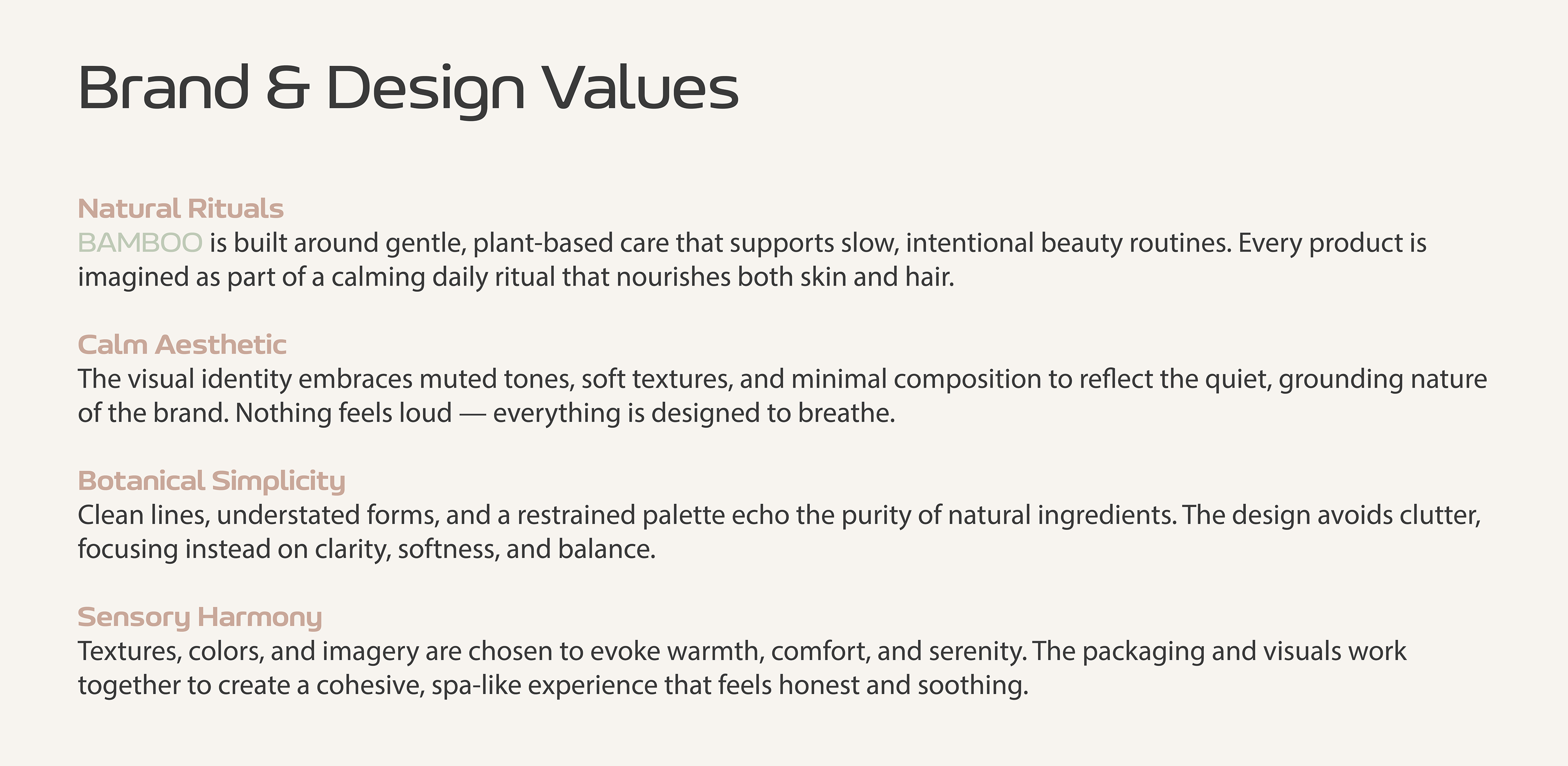


bamboo is built around calm, natural beauty. Its identity blends warm neutrals, gentle shapes, and minimal packaging to create a world that feels clean, modern, and quietly premium. The leaf and heart‑shaped mark bring softness and organic warmth to every touchpoint.
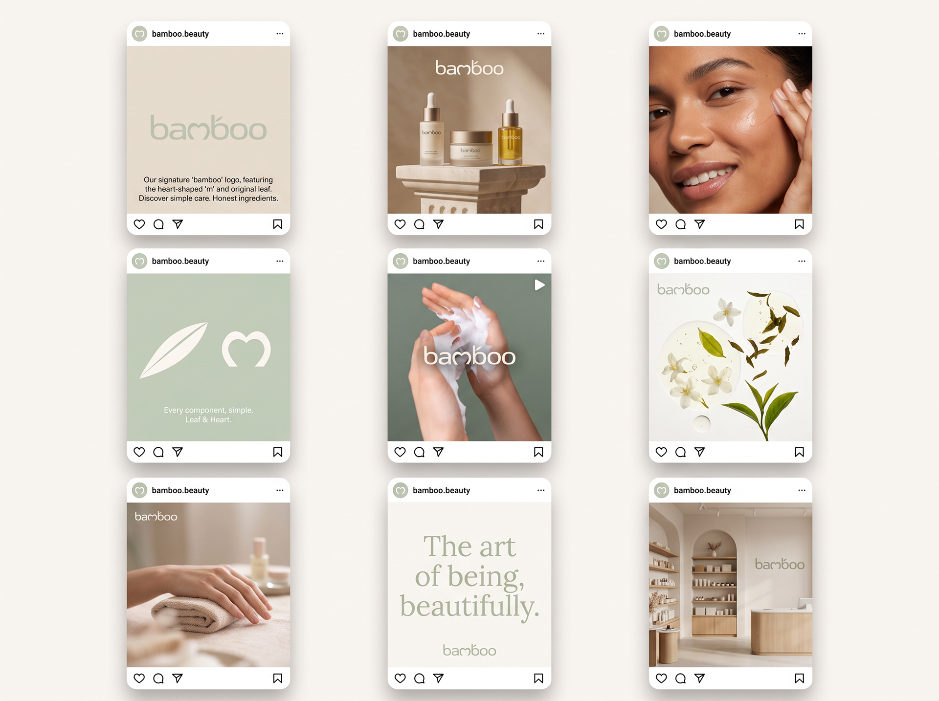
This visual language extends into the brand’s social media presence — a curated feed of product rituals, client moments, packaging details, and serene beauty imagery that reflects bamboo's gentle, editorial aesthetic.